Chapter 4 | Part 2
Visuals
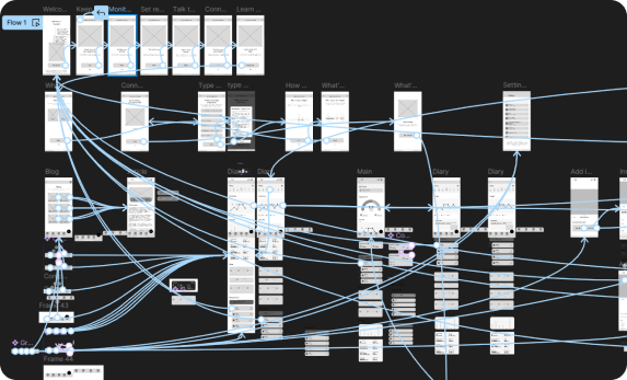
Iteration Nation
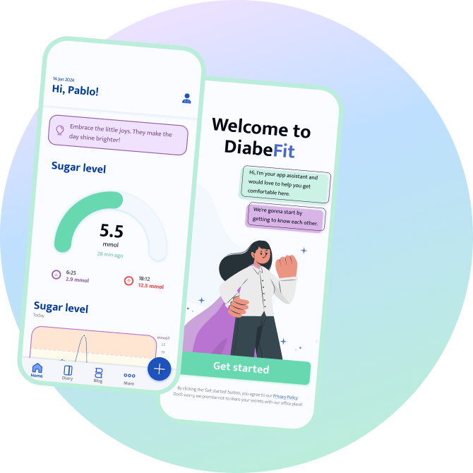
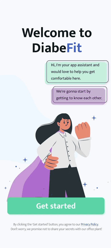
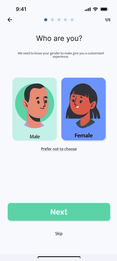
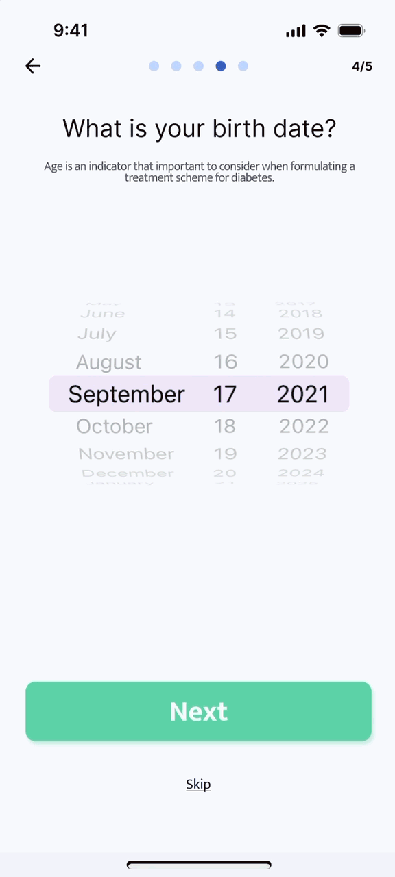
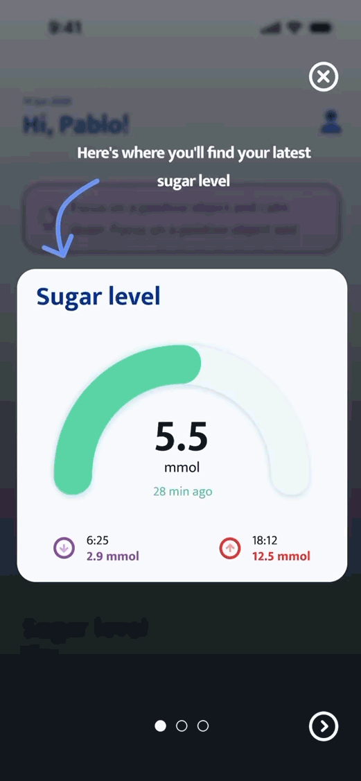
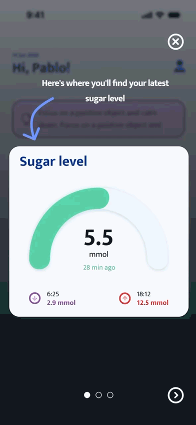
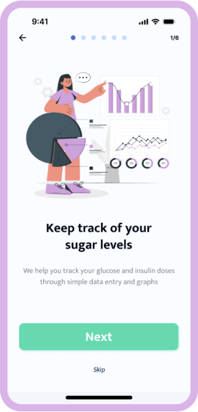
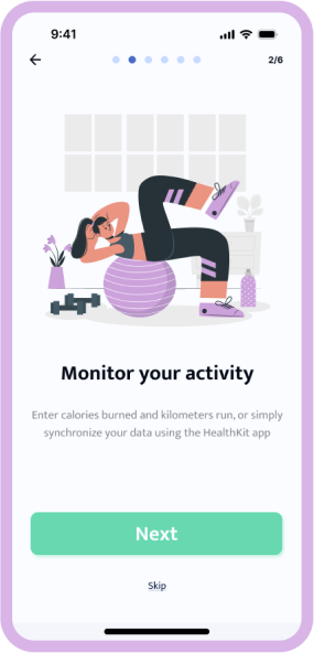
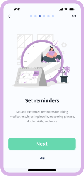
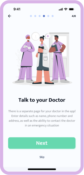
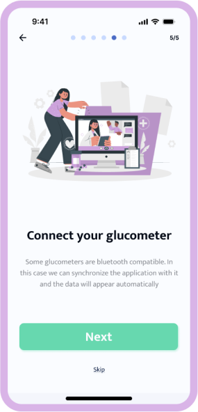
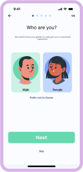
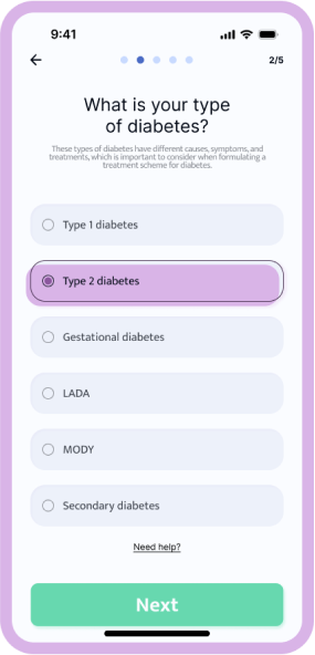
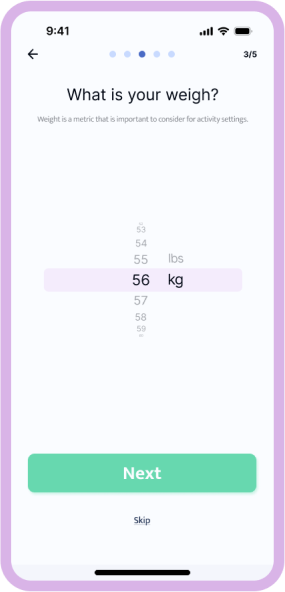
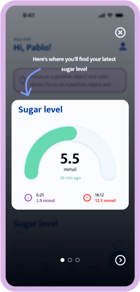
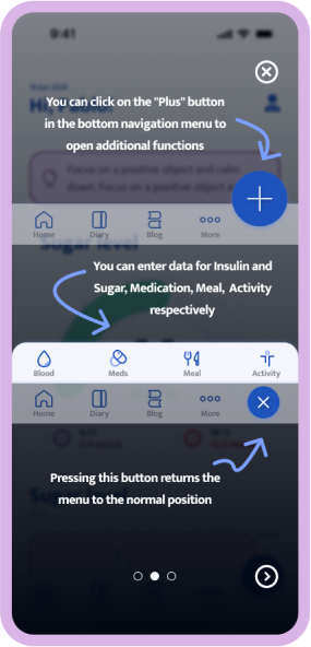
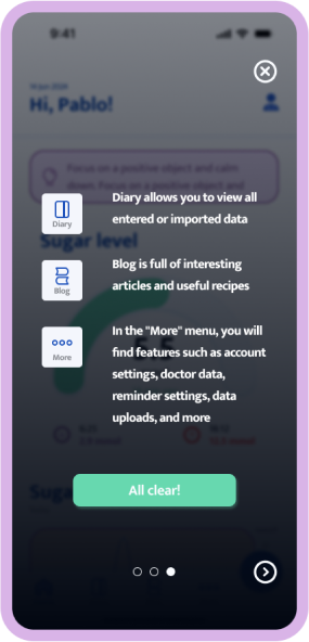
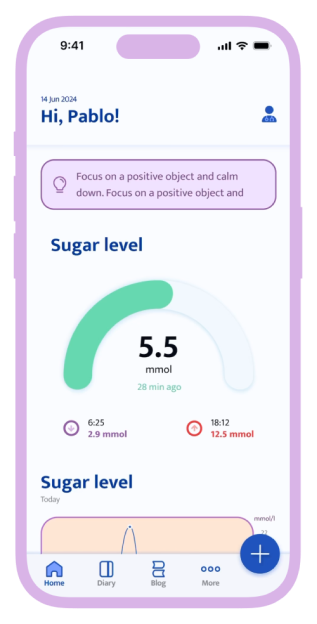
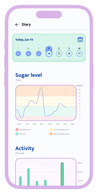
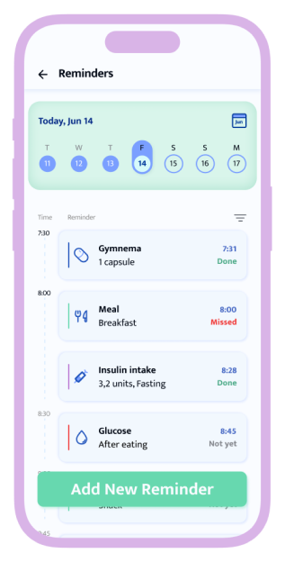
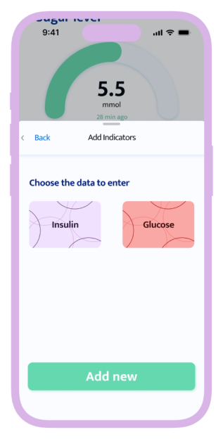
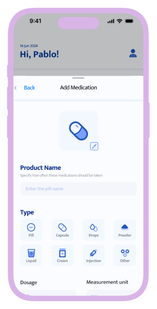
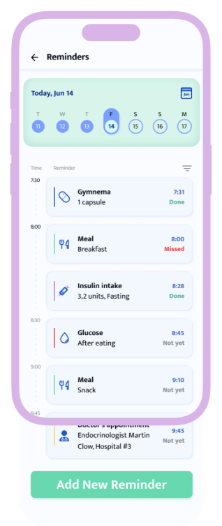
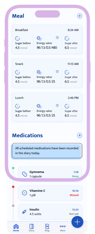
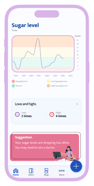
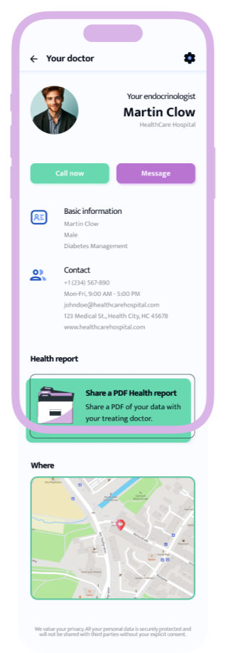
When you have diabetes, it's important to keep track of your medications, the amount of sugar you eat, and to check in with your doctor regularly. Therefore, in my app, I have tried to emphasize easy and accessible entry and viewing of this data, as well as setting reminders.